:: Encore Theatre Magazine ::
:: British Theatre: Polemics & Positions ::| [::..navigation..::] |
|---|
| :: Encore Revivals |
| :: Encore Heroes |
| :: Encore Futures |
| :: Encore Snapshots |
| :: Encore Polemics |
| :: Encore Resources |
| :: Encore Criticwatch |
| :: Encore Commentary |
| :: Encore on Encore |
| :: Encore Awards 2003 |
| [::..site feeds..::] |
| :: Atom |
| :: RSS |
Encore Theatre Magazine
::Front Page::
:: Saturday, October 07, 2006 ::
Posters at the National
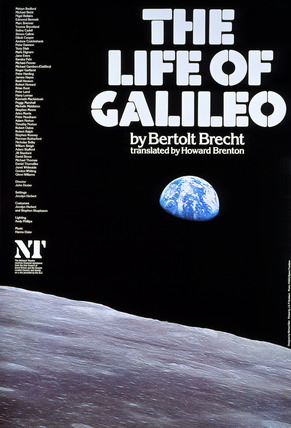
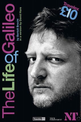
The National's decision to make available a generous selection of its past theatre posters (at, let's just point out, scandalous cost) unfortunately reveals rather plainly the sharp decline of the design work recently. Look at the difference between these images.The poster on the left isn't all that imaginative. But it's a modern image, which already makes the connection Brecht is making with the technology of our age, and it is estranging in a certain sense: the earth seen from elsewhere, the earth displaced from the centre of vision, suggesting the object of Galileo's own struggle. The colours are muted but strong the lunar surface contrasting with the partially shadowed earth, struggling perhaps to emerge. The earth's vulnerability is suggested as is, faintly, an atomic structure that underscores the nuclear politics against which Brecht wrote his crucial second draft. Tonally, subtly, the poster suggests the dark polarities of the play. What does the 2006 poster tell us? It tells us that Simon Russell Beale is in the production and that's it.
The National has through-branded itself across all its print material. The sans-serif font, emphasising and varying the letter design only with emboldening. It looks modern, and the diagonal arrangement is a subtle nod to a period of design from the late 1960s. Look at this poster:
It's actually from 1968, though it could easily have been used at any time over the past three years. The diagnonal lettering suggests a modernist era of design though the colour palette is contemporary. The starkness and clarity of the font is both accessible and imposing. These things are all appropriate to the theatre they represent.
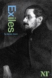
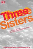
But some less exciting principles also appear to inform the new designs. They almost all have human figures on them. Often the figures are looking at the camera and the viewer. Perhaps this is designed to make us feel connected to the image (if we are simpletons). Otherwise the images are very noise-free; no castlists as in the Galileo image, colour restricted to the lettering, the only non-essential detail being the names of the sponsors, which is a clear sign of the difference between then and now. While images from an earlier era show action, the body in motion, a moment of emotional intensity, conflict or abandon, the new human figures are usually in repose, not in the midst of some moment of, well, drama as in Edward II. The effect is to rebrand the image of modern, efficient, cool, streamlined, and very very boring. Look at these:
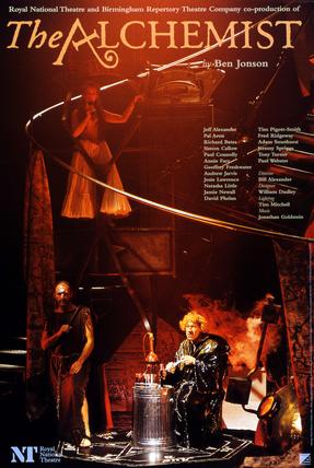
The left is full of drama, life, colour. It tells us about the design of the show, that elegant metal loop linking the jaunty title to the comic image below. The sense of a plot, the absurdities of the alchemical processes are all captured. We know the kind of play it'll be and we have a sense of the production and vaguely of the kind of story. What do we know about The Alchemist in 2006? We know that it has Alex Jennings and Simon Russell Beale in it. Admittedly the whispering motif tells us something about the fraud plot that structure the play but this is rather cancelled out by Alex Jennings's steady gaze at the camera which seems faintly amused but is otherwise expressionless, an effect enhanced by the cool monochromaticism of the image. While 1996's poster could be accused of being too busy, ten years later we seem to have gone in entirely the opposite direction, the poster aggressively refusing to tell us anything about the show at all.
Look at these images; it's hard to imagine a duller series of posters, less inclined to give you the slightest sense of what the show is about:
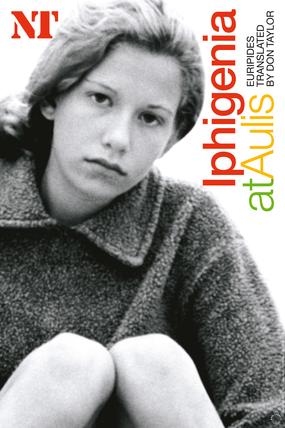
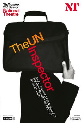
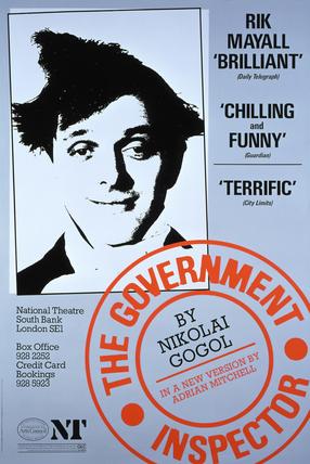
The posters don't always simply advertise the cast. There are more abstract or intriguing images. But another constraint prevents these from being truly effective. The National recently signed a deal with Getty Images and most of the non-cast images are taken from the Getty archive. This is, no doubt, an extensive library. But since they can only use non-recognisable images, with that cool, affectless sheen, their choices are much reduced, and some of the matches of image to play are flimsy. For Iphigenia in Aulis (pictured) they used an image of a young girl, gazing vacantly into the camera. This is quite meaningless unless you already know the play, and even then it doesn't declare very much. For The UN Inspector (pictured), they used a rather more striking image, an almost Pythonesque bureaucrat with a suitcase on his shoulder, obscuring his head. This is a good image, nicely surreal and appealing. It sort of picks up the theme that the inspector is more a figure of their guilty imaginations than a real person. But it says little about the style or tone of the show. You might realise it was a comedy, but not that it was a farce. In fact nothing about the image suggests anything about period, genre, subject or style. When you compare it with the impishly witty poster for The Government Inspector (pictured below), it's clear how vague and imprecise the more recent poster is.
I suppose the role of the poster has changed. They used to be flyposted around the area. There's less passing trade now and the sources of information are much broader than they were twenty years ago. You rarely see a National Theatre poster anywhere except in and around the building. So it's largely to advertise what's on to people who have already made a commitment to the National by being there. Branding helps clarify the National's profile across all media. But it's a pity that the imagination that went into the posters has so dramatically dwindled. It places disproportionate significance on the actor; yes, everyone wants theatres to be full but if people are there to see the actor rather than the play, something will get lost from the experience. At their best, posters are a way of leading audiences into the imaginative experience of the theatre; just advertising who's going to be in it does not lead to any act of imagination at all, just to the experiencing of looking at a famous actor.
What's disappointing is that so much else at the National has changed for the better in the last three or four years. It's become a genuinely exciting place to go. Ultimately perhaps, the quality of the posters does not matter so much - maybe it's as trivial as worrying about the poor standard of the adverts on TV - but the posters do have a function of preparing an audience for the event they may wish to see, and in representing the National Theatre to the world and to memory. They impress themselves upon history and it would be a shame if the sheen of bland star-shots is allowed to characterise the National's current era. It also suggests that somewhere along the line, the National's marketing department has developed an attitude to its audience that is condescending to the point of contempt. It's a kind of virus and needs to be stopped before it spreads.
:: posted by Theatre Worker at Saturday, October 07, 2006
...


 : 8/10/06 7:48 pm : 8/10/06 9:30 pm : 10/10/06 10:15 am
Plus, the images you talk about don't make sense unless you know the play anyway.
: 10/10/06 10:33 am : 10/10/06 11:00 am : 13/10/06 11:39 am : 14/10/06 12:44 pm : 17/10/06 5:26 pm : 19/10/06 4:09 pmAgree about the National. I love it. It is much better now. The posters though dull(ish) are maybe bordering on cultish in a positive way?
 : 24/11/06 9:00 am